Reimagine the Org Chart
The Overlap #14
Welcome to The Overlap, a biweekly newsletter that explores the relationship between product & organization design. It comes out every other Wednesday morning.
This one’s on how the traditional organizational chart is outdated. We need a way to visualize an organization as a dynamic network rather than a static hierarchy. The MVP of a new org chart: a network of teams that anyone in the org can update.
The updated org chart needs to be easily updatable
If there’s any tool that is stuck in its own ways, it’s the org chart.
From an essay I wrote, Your design reveals your assumptions about people:
There are three problems with the org chart:
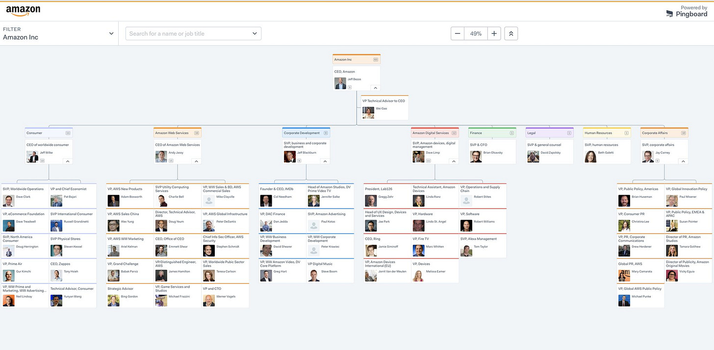
It hasn’t changed in a hundred years. Cars, phones, hardware, and software improved dramatically throughout the 1900s. Amidst these improvements in the past hundred years, the org chart stuck with its own ways. Today’s org charts still look like what they looked like in 1910.
Teams and roles change faster than the chart’s ability to make changes. Powerpoint can’t keep up with how quickly an organization’s structure updates itself. That’s why most org charts are outdated.
Org charts don’t reflect non-hierarchical relationships. If you’re an engineer at a >100 person company, the org chart likely shows that you report to a tech lead. However, you constantly work with designers and product managers. Your org chart doesn’t capture the fact that you work with others outside your discipline.
Despite these problems, we still use it.
Why is that?
You get a singular view of every leader at your company. This helps you figure out who’d be the best person to reach out to when you need help.
If your sales deal with a large enterprise has been under legal review for two months, you can reach out to the lead lawyer on your case to understand why it’s taking so long.
If you want to understand why Notion is blocked, you can ask the Head of IT to point you to the person who could help you understand why it’s blocked.
If your raise from your new promotion has not kicked in, you know who to reach out to in HR.

The org chart stops being useful when your HR contact left for another job, the Head of IT switched teams, or the legal team reorg’d. The moment a change occurs, the chart is obsolete.
Organizations as dynamic networks
Good information architecture is collaborative rather than a single-person effort. The new org chart would be editable by anyone within the organization. Similar to how anyone can make a change to open source code through a clearly-defined workflow, the new org chart is editable by anyone in the org, with some workflow that ensures the change is accurate.
Remember how taxonomy is the relationships between the parts of the whole? The new org chart would show the organization’s taxonomy. Show me the teams that make up the organization, the roles that make up that team, and how each team relates to each other.
Aaron Dignan shared an inspiring vision for what the new kind of org chart could be:
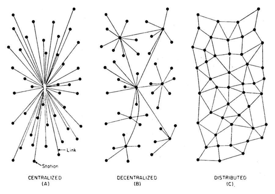
If Facebook is the social graph, we need an equally elegant solution to the organizational graph. This tool would be a living, breathing org chart — a dynamic network — combined with what I’m calling “GitHub for organizations.” What roles exist inside our companies? What rules? What policies? Who has authority? Even if the answer is “everybody” (heck, especially if it’s everybody) we need to know. We need a tool that helps us change those things, edit those things, and share those things inside and outside our companies— easily or automatically. Imagine if you could take your world-changing maternity/paternity policy and share it with a friend’s company with one click, like a developer sharing code on GitHub. Now imagine millions of companies sharing what’s working for them, seamlessly.
The idea of visualizing an organization as a dynamic network isn’t new. It goes as far as 1960 when Douglas McGregor published The Human Side of Enterprise:
It is probable that one day we shall begin to draw organization charts as a series of linked groups rather than as a hierarchical structure of individual “reporting”relationships.
Fortunately, McGregor was right. We’ve seen alternatives to the traditional org chart. Let’s look at three examples.
Example 1: Sociocracy and Holacracy
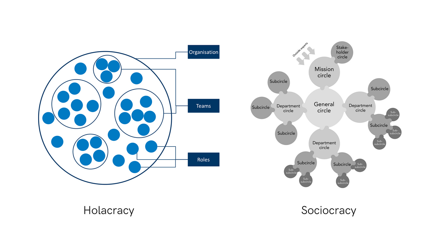
Sociocracy and Holacracy suggest a specific way of structuring a company:
Organizations consist of Circles.
The organization is a Circle that consists of Subcircles.
A team is a Subcircle within an organization.
A role is a Subcircle within a team.
Roles are filled by people.
Each role has a clear purpose.
Each team has a clear purpose.
The organization has a clear purpose.
Both differ in the way they visualize structure. In Holacracy, Circles live within Circles. In Sociocracy, Circles branch from other.
However, notice that there is still a hierarchy in both cases. In Holacracy, some circles are a part of larger circles. In Sociocracy, the center circle is perceived as powerful, while the circles on the periphery are seen as marginal.
This gets at an important point about self-managing organizations: hierarchy still exists. But rather than a hierarchy of people, it’s a hierarchy of purposes. This is tricky to understand yet super important: every role’s purpose helps their team’s purpose, and every team’s purpose helps an org’s purpose. From Many Voices, One Song: Shared Power With Sociocracy:
Hierarchy in sociocracy is not a hierarchy of people. Since every circle comes with a piece of the overall aim and domain, and aims and domains are nested, it is aims and domains that stand in hierarchical relationships to each other. Those aims and domains are tied to circles which are filled by circle members and holders of roles.
The key principle: design your organization’s structure based on the organization’s purpose and strategy, rather than based on its individuals. By doing this, your organization is designed to achieve its purpose.
Example 2: Neils Pflaeging’s Value Creation Structure
Neils Pflaeging suggests three kinds of organizational structures:
Formal structure: the traditional hierarchy.
Informal structure: the relationships between individuals.
Value Creation structure: the relationships between teams.
This claim is audacious, at best:
[Value Creation structure] is the least understood of the three structures of any organization. Ironically, it is also the one structure in which actual work can get done. It is here where the key to a much-improved understanding of org effectiveness lies.
Of course, the Thought Leader Consultant promotes a third model (Value Creation) that is more superior to the first two (Formal and Informal Structure). We’re being sold a third way, which profits the consultant.
However, there is a lot worth appreciating about his theory of the Value Creation structure. One thing I appreciate is how it visualizes how teams (rather than individuals) relate to each other. Imagine if your org chart shows the relationships between the different teams at your organization. That would be mad useful.
Example 3: AutoDesk’s Organic Org Chart
AutoDesk, a multinational public software company, visualized how their org chart evolved from 2007 to 2011. If you haven’t watched this video, watch this before you keep reading:
Amazing, right?
Since each node is an employee in this video, I would love to see what it would look like if each node was a team.
The minimum viable reimagined org chart
Here are the top seven features I’d love to see in a revamped org chart:
I can see my entire company visualized as a network, where the nodes are teams.
I can see dependencies between teams and the nature of each dependency.
I can see all decision rights each team owns.
I can see the roles that make up each team.
I can see the team member that fills each role.
Anyone can update this network instantly.
Anyone can see all changes made to the network, sort of like git blame or Google Docs version history.
There’s so much more to include, like the ability to propose, amend, and share (internally and externally) company policies. But if I were to prioritize features for an MVP, these are the seven I’d prioritize.
One gotcha: you can do the seven things above with software that’s already out there. My previous company used Glassfrog to visualize our structure, roles, and policies. My current company uses Notion. Even Roam can visualize dependencies between teams.
But when you work at a 30,000-person company instead of a 30-person company, that’s when I think we need a new tool. Teams at 30,000-person companies depend on other teams to get their work done. Those other teams depend on other teams, who depend on other teams, ad infinitum. If we could visualize those dependencies, teams can reduce these dependencies and govern more distributed ways of working.
I’d love to hear your thoughts!
Of course, this is just a hypothesis. It needs to be validated/invalidated through research before pursued more seriously.
Other questions that come to mind:
Would a >500-person company value these five features?
Is it more valuable to build something for a specific use case? Such unblocking team-level issues more quickly?
How opinionated should this org chart be? To what extent should it push traditional organizations into a distributed structure?
If it’s meant to nudge traditional organizations to structure themselves in a distributed way, what if an organization keeps its centralized structure even after using the tool? Should we live with that?
What would it look like if we solved this problem with tools like Maptio, orgvue, and Kumu?
What would a proof of concept look like?
As a product and org nerd, you have thoughts on this too! Here’s what I’d love to hear your take on:
In your dream organizational graph software, what features exist?
What tools are already doing this well?
Reply in a comment below. 🙏🏽
What I’m Reading
1/ The Amazing, Shrinking Org Chart
The collapse of organization charts in our thinking reflects a deeper collapse of the underlying imagined organizational realities. The organization chart is shrinking because we are slowly recognizing what has always been true: there is much less “organization” to chart than we’d like.
I shared this in The Overlap #4, but I found myself reading it again recently.
2/ Human Networks: Coupling, Cohesion & Encapsulation
Spencer Pitman, a former colleague of mine, applied the principles of well-designed computer networks to organization design. This is one of my favorite essays on org design. It examines the similarities between two “seemly” different fields, in true Overlap fashion.
3/ 11 Practical Steps Toward Healthy Power Dynamics at Work
Last week, my colleague Brendon Avalos shared with our team this essay by Rich Decibels. It brought me back: I first read this article in 2019. Reading it a second time around felt centering: I’m reminded that the patterns and practices I’m an advocate of add up to healthier power dynamics. I’m sure I’ll be revisiting this essay throughout my career.
4/ Intel’s Disruption is Now Complete
Apple’s ARM MacBooks signify the disruption of Intel, a company that was once a disruptor. Great read by James Allworth.
See you in two weeks,
–tim


I'm a bit late to this party but I had a few thoughts.
The first is around staffing work to the team (bring the work to the team, not people to the work).
In a dynamic and fast moving company there is a need to scale up and down value streams. I like to think of it as - for a given period (year, quarter, etc) we want to fund this team or set of teams with the objective of achieving X. However next quarter we might need to invest in another set of problems.
So at any given moment, I want to see each team, their roles, and the folks mapped to them, but I also what are the capabilities of these teams.
I think of teams as t-shaped (just like the individuals on the team). The company might want to invest in a few different areas. I want to see what teams are best suited to tackle these problems. You can imagine a team that says here are our current roles, but also here is what we are passionate about, the problems we like to solve, and our capabilities and skillset. This is also helpful when looking to level up teams, what skills should be helping our teams learn.
The other thought I had was more about folksonomy vs taxonomy. Especially when you are having everyone in the company update the structure, what you will find is that everyone has a slightly different mental model of how best to categories or assign things.
What I think would be cool, would be a tool that would support multiple views of this data structure. Some might want to view in a way that maps to holocracy other might want a view of leadership, others how teams interact. I think having one size fits all is part of the problem. I feel the same way about IDEs and project structure of codebases. Some love hierarchy others want more flat structures.
Anyway, great article!
What I see in most big and medium companies nowadays are three layers of representation:
1. The traditional org chart (always present).
2. The fuzzy, helpless, mostly useless Spotify-like organizational layer of squads, tribes, chapters, guilds and so on (almost always present because is a proxy of "doing Agile").
3. The real value stream of work, with cross-team and cross-department, cause of a million dependencies and coordination overhead (never, ever represented in any form).
For this reason I don't really buy into the idea that the most granular item in a networked representation of a company should be the team: at the moment I'm only seeing teams with shared people in them, meaning that each team member of any team also work for other two or three teams.
So, in order to describe a real value stream - which is what wins the bread for the company at the end of the day - you should be connecting people first (using their primary domain knowledge or skill as a "marker", not their role), and infer where team should "emerge" only later.
The problem I see of mapping out an organization starting from teams is that teams you are going to find are almost always a by-product of the traditional org chart even when they are represented with a hybrid, pseudo-Spotify, matrix-based model. What's worse is that layering a Spotify model on top of the traditional org chart is going to fracture the value stream even more.
What you are going to find has biases and a certain level of organizational debt already built-in.
So, back to your features.
"1. I can see my entire company visualized as a network, where the nodes are teams.": yes, and there should be a more granular level to start with, one taking into account people.
"2. I can see dependencies between teams and the nature of each dependency.": yes, and for tat I would borrow the activity/knowledge/architecture types of dependencies from Dominica DeGrandis' Making Work Visible.
"3. I can see all decision rights each team owns.": not sold on how much this one should be relevant, decision rights sits at the level of the traditional org chart most of the time, it's something I would add later (I'm thinking in terms of actually doing this as a real mapping exercise).
"4. I can see the roles that make up each team.": yes, and see point 1., I think that domain knowledge and skills are far more important than roles.
"5. I can see the team member that fills each role.": yes, see above, I would put this one earlier in the process.
"6. Anyone can update this network instantly.": YES, PLEASE.
"7. Anyone can see all changes made to the network, sort of like git blame or Google Docs version history.": I WANT IT ALL.